For this photography project I chose it do the theme texture because I thought it would be an interesting theme to explore. Within this theme there were loads of different photographers that I thought linked to my chosen theme texture to chose from which I loved because all the photographers photos all has really different unique styles to them. Within my texture photography project I choose to research and analysis Adam Pespane, Lucy Shires, Bruce Montagne and Adrienne Adam.
Adam Pesapane

I chose to analysis this texture themed photo taken by Adam Pesapane because I admired the way instead of using natural already placed and positioned props for this photo he compacted straws into a tight place to make this affective photo. I find this style of photography unique and different to the other photographers I chose to research because of the way he made an interesting textured photo out of straws. This photo fits in with my theme texture because of the way the straws are making a circled pattern. This is a naturalistic photo as its normal objects instead of being made by a computer or Photoshop. I think natural light has been used in this photo as it doesn’t look like it has been taken in a photography studio with artificial lighting. The photographer has captured this picture in a way that the light would reflect off the straws to make the photo look brighter. The different colour tones in this photo is whites greys and blues from the straws, making it a cool toned photo which I think works well with the textured pattern. I find that the use of straws in this photo makes it most interesting because it’s a different type of texture to my other photographers. What strikes me most about this photo is the way the straws create different tones and affects from the lighting. I think the effect of this photo would work even better if the straws were all the same length and came up to a straight surface. This photo would be easy to remember because it’s so different to any other texture photo. I chose to analyse this photo because its inspired my own photography work while working with the theme texture.
Lucy Shires
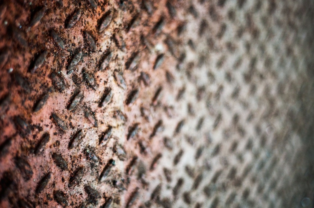
I have chosen to take interest in and analysis this photo taken by Lucy Shires as it fits in with my texture themed photography project. This photo fits in with the theme texture although it’s also in the theme urban textures which I really liked as it’s so different to the other photographers I have decided to analysis. This photo fits in with this texture themed photography project well by being at a close up angle of a rusty and bumpy surface creating an interesting texture. The photo is more focused on the rusted part of the surface as it looks more affective and creates a bumpy texture, as the photo gets less rusty and less focused the image turns silver instead of the orangey brown coloured rust in the focused foreground of the photo. This is a naturalistic image because it’s not focused on something abnormal. This photo looks like it’s a platform outside, I think this by the way it’s rusted and by the use of natural lighting instead of using artificial lighting from a stupid. The lines in this picture make it look more affective because of them being the same shape although there are two different directions they are facing in and some are standing out more than others. The colours and tones in this photo go from very autumn looking colours such as oranges and browns where it is rusty then goes to a silver metal looking tone in the unfocused background. In this photo the attention is mostly brought towards the rusted texture in the foreground of the photo because of the different tones and textures. I think all that was needed in this image was the camera, natural lighting and outside textured surface. What strikes me most interesting in this photo is how its more focused on the rusted part in the foreground and gradually fades out into the background so the attention is brought to the textured colours and tones in the foreground of the photo. The camera positioning and angles in this photo creates a more affective distance between the foreground and background, the camera angle starts quite low then it’s able to see a wider distance as it gets further into the background which makes it look more affective. I think the natural lighting works really well in this photo as it gives it more of an outside autumn looking affective. Through researching and analysing this photo I think it will help me with my own photos as it’s shown me how you can make different unique surfaces and textured look affective in a photo just by changing the positioning of the camera. This photo makes me think it’s based on an autumn theme and if it was my photo I would base the title around that. Even though this photo is based around warm colours including oranges and browns by looking at it I would think at the time of the photo being taken it was at a really cold time of the year.
Bruce Montagne
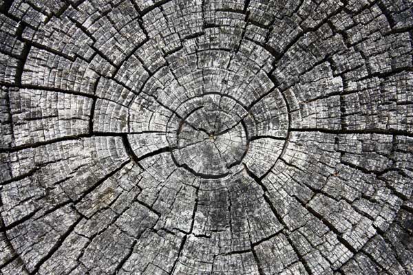
This photo to taken by Bruce Montagne inspired my own photography, as I have responded by looking at the textures of wood grain and patterns. I particularly like the way the lines crack in a circular motion. It makes the overall shape of the cross section fragmented. The image is taken in monochrome; this assists the image’s contrast the show the detail of the lines. In my surroundings I feel that achieving photos linked to nature in this style would be a challenge, however I will use what I have access to and not just use his work to inspire me but I aim to develop my skills in creating and applying monochrome techniques and close up framing to capture linear detail as well as formed, fragmented shape.
Adrienne Adam

This photo taken by Adrienne Adam inspired my own texture themed photography work, as I have responded by taking similarly effective photos of leaves with rain drops on them. I can see very clearly the combination of different colour leaves, which show a range of autumn tones. The typical shape of the leaf is repeated and overlaid on each other to give the image depth. The texture of each leaf is defined by the directed natural lines within the skeleton of the leaf and the droplets enhance specific areas of colour and detail. This image reminds me of the fallen leaves as autumn ends and winter begins, as on this day I writing this, 4th November, the leaves have fallen to the ground, there is a spectrum of browns, greens, reds and pinks and the rain is falling hard, creating wet ground, pounding onto the leaves, leaving them soaked from the early winter rainfall.
I will use todays weather conditions to capture a collection of textured leaves and recreate effective lighting to produce a personal response to this inspiration.
I will use todays weather conditions to capture a collection of textured leaves and recreate effective lighting to produce a personal response to this inspiration.
Photo-Shoot 1: peeling paint and rust


Photo-Shoot 2: wood and leaves


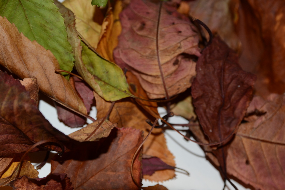


Photo-shoot analysis
Within my two different styled photo shoots taken within the theme texture I was inspired by four different photographers, Adam Pespane, Lucy Shires, Bruce Montagne and Adrienne Adam. I took into consideration all the different styles of photos each photographer had taken and used them together to get the outcome of my photo shoot. My first photo shoot 'peeling paint and rust' inspired by Lucy Shires was inspired by this artist because I like how her photography is urban looking because of the textures she takes photos of so I used this in my own work. My second photo shoot 'Wood and Leaves' was inspired by both Bruce Montagne and Adrienne Adam because of the textures used in there photos, I liked the way they used natural outside plants and surfaces to create textures in there photos.
The first photo shoot was all taken outside using the natural lighting from the sun. I took pictures of paint peeling off a wooden surface , chipped bricks and rusty surfaces to create a urban looking textured photo shoot, I intended to take these photos outside because I thought the natural lighting would work best. The pictures I took of rusty surfaces and peeling paint was inspired by Lucy Shires as I liked her more urban approach to the theme texture. I took the photos of peeling paint at a side on angle I thought would look most affective in the way that it showed the different directions the pain was peeling in and made the foreground and background less focused than the middle ground so the attention was brought to the peeling paint. I feel that the use of lighting reflecting off the paint made my photos more affective as the pieces of paint come off in different colors and tones.
The second photo shoot I took a series of photos taken outside in the natural lighting and a series of photos taken inside a studio using artificial lighting to show the different effectiveness between the lighting. the series of photos taken outside were of bark on a tree, wood splintering from a bench and leaves. I think the natural lighting worked well with the wooden bench as it showed different tones in the wood and made it look more defined. the natural lighting didn't work as well with the leaves outside as the sun wasn't out as much so I wasn't able to get the affective photos I had intended to take although the series of photos of leaves I took inside the studio using artificial lighting worked really well and made different shadows and tones upon the leaves in which I had intended to do. I like how the different tones and colors of the leaves make the photo look more Autumn themed.
Selection of best results


Statement of Intent
I intend to use my most successful results when investigating texture to develop further in my own way. I found that using the DSLR and controlling the depth of field very useful, so I will aim to ensure that this is evident through my experimentation.
I believe that I have captured a range of textures in my surrounding areas that demonstrate line, shape and form .
Editing them further I will explore changing hues and focal points to enhance what the outcome will be.
I believe that I have captured a range of textures in my surrounding areas that demonstrate line, shape and form .
Editing them further I will explore changing hues and focal points to enhance what the outcome will be.
Final Development

|
|
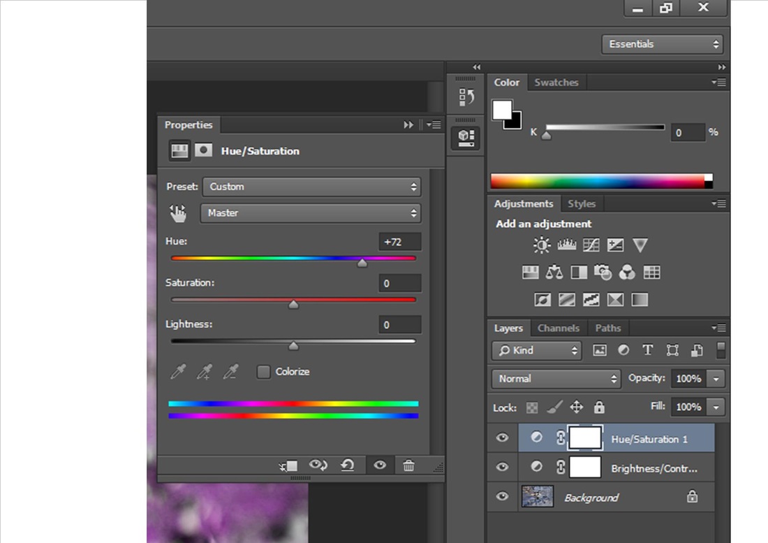
in order to edit this photo to the best I could through Photoshop I thought it would look most effective by changing the hue to +72 to make the color of the image change making it change the blue to purple and the light colored wood to green, I also decided I wanted the attention drawn to the middle of the image where the paint was cracked showing the wood so I blurred out the bottom and two sides of the image.
|

|
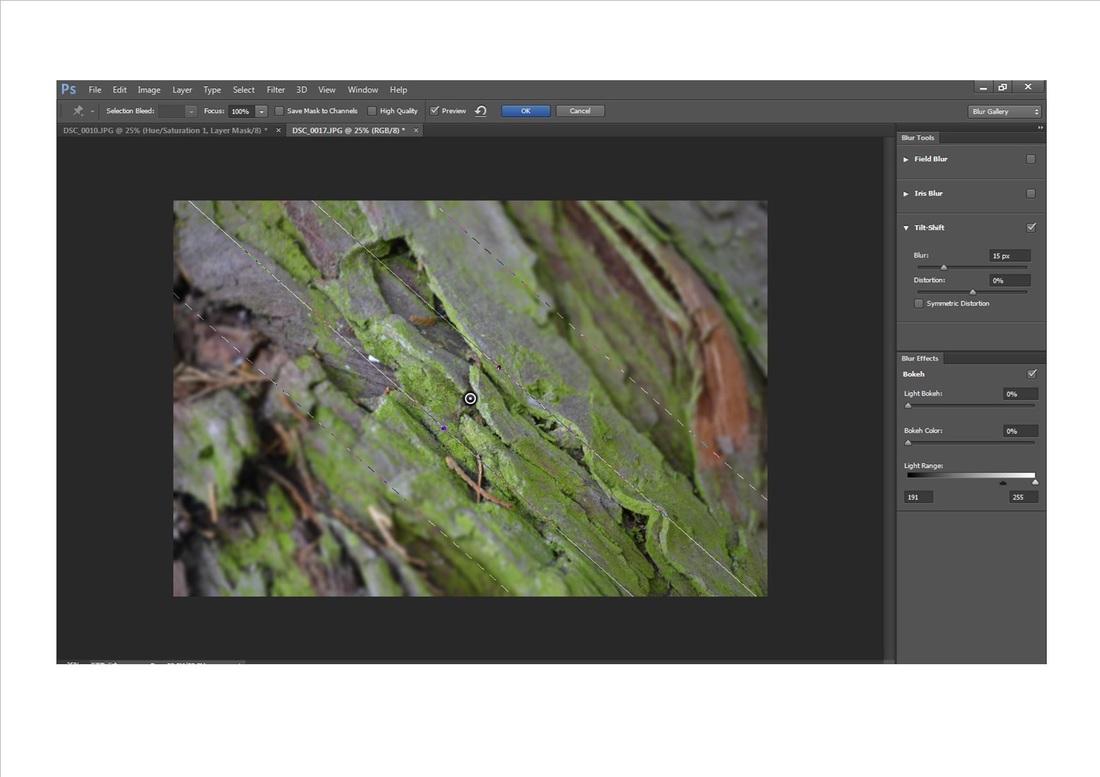
in order to edit this photo to what I thought would look most affective through Photoshop I went thorough the blur tools to see what would look best and I ended up choosing tilt shift blur at 15px directing diagonally from one corner of the image to the other as I thought this would look most affective going in the same direction as the bark on the tree so all the attention was drawn to that part of the image.
|

|
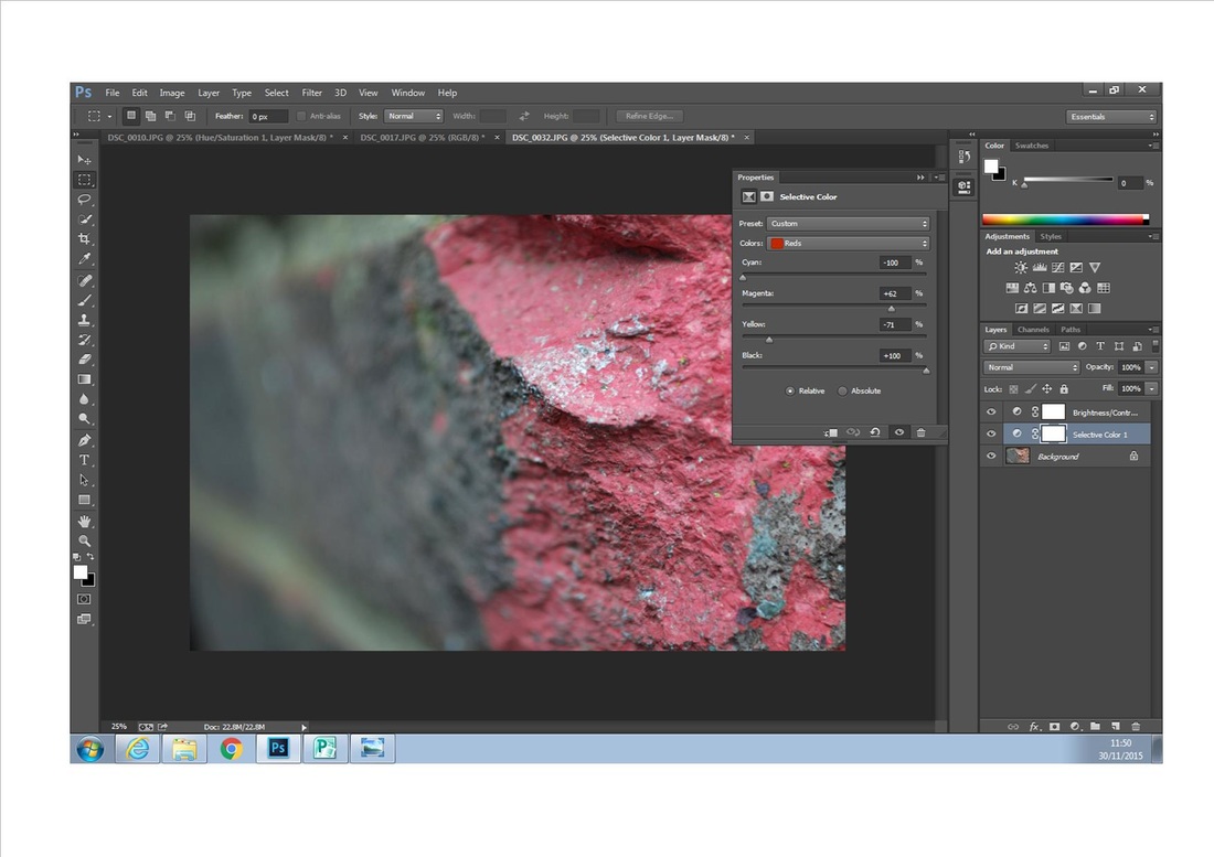
though out editing this picture I played around with the brightness to make sure it wasn't too dark to understand the subject matter then went through selective color and changed the color of the brick from a red/orange color to pink to make it more original and different, I didn't have to edit the picture to blur out the back of the picture as this was already done and thought about while I was doing my photo shoot so I made sure the camera made this effect for me.

|

|
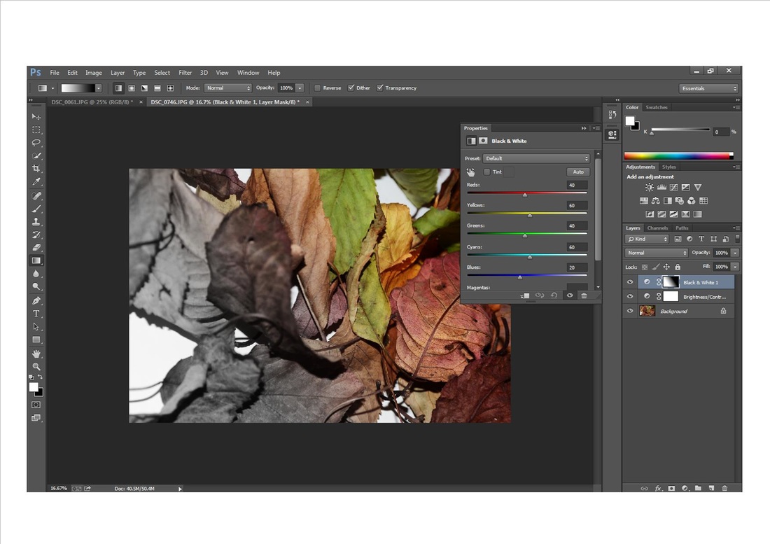
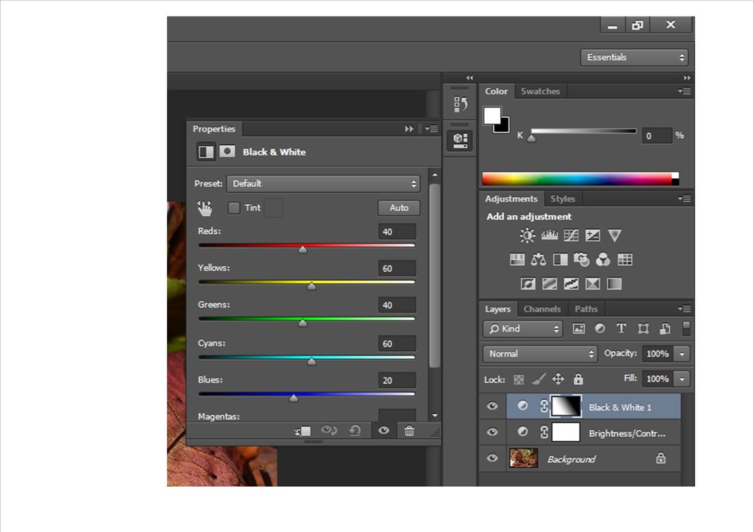
I liked editing this image as it reminds of things turning sad, for example the light turning to dark and dull which I find looks really affective, to edit this photo I used the black and white gradient tool to gradually go from one side of the image to the other turning it from color to black and white.
|
|
the way I edited the picture reminds me of autumn gradually turning to winter as the color of the leaves are all burnt out color like reds and oranges with a few greens all turning to blacks and greys as the black and white gradient tool goes from one side of the image to the other.
|

|
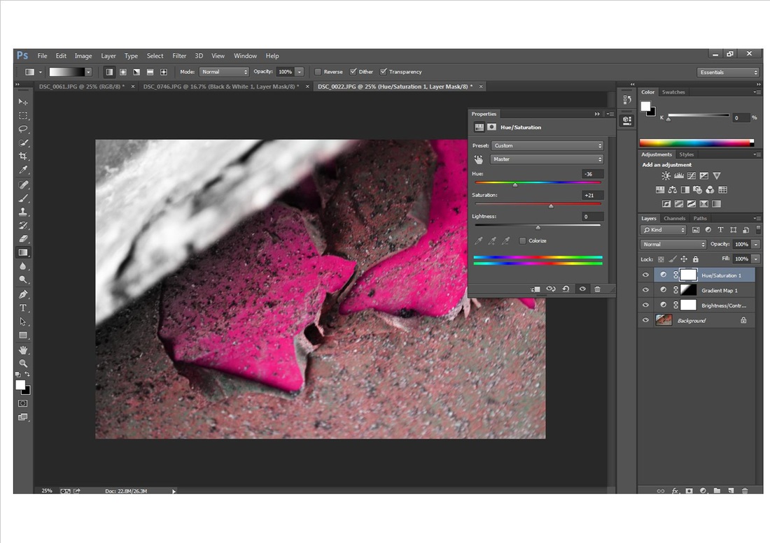
in order to edit this image I also used the black and white gradient tool as I found this looked most effective with the rusty peeling metal, but found that a different color may make it look different to the others so I again used the hue and saturation to change the greens and reds to brighter and darker pinks as I found this suited the image best and then used the brightness just to brighten it up a little more.
Final Responses


I chose this images as my final responses as I felt they best portrayed my theme texture and were most affective,
